Using the 3D accelerated power of modern
video cards to do basic 2D desktop tasks is a novel concept. OS X
pioneered it. Vista and Linux copied it. Haiku should improve it. This will involve significant
-- major, in some cases -- changes to the Deskbar,Tracker, the app_server, and possibly other system components, but
the changes will be well worth it. Visual effects detailed here are not
merely "eye candy", as some would call it, but have the dual purpose of
giving the user a better idea of what his computer is doing while
making the interface more visually appealing.
Services Provided:The windowing system and desktop are intended to provide a number of services
- Up-to-date status information (time/date, new mail, reminders, etc)
- Program-launching facilities (desktop icons, quick launcher, etc)
- Functionality to work with multiple open programs (Twitcher, workspaces, etc)
- Window management tools (resize, minimize, move, move to front/back)
There are two basic reasons for these services: the user needs to know
what the system is doing at any given point in time and the user is
doing multiple tasks simultaneously, whether he realizes it or not.
No More DeskbarWhat?! Am I crazy? Nah. It's just that the Deskbar's time has come.
There are four current uses for it: launcher, up-to-date system
information, system settings, and a loose collection of system-level
functions, such as About BeOS and Find. They will all be replaced with
better solutions.
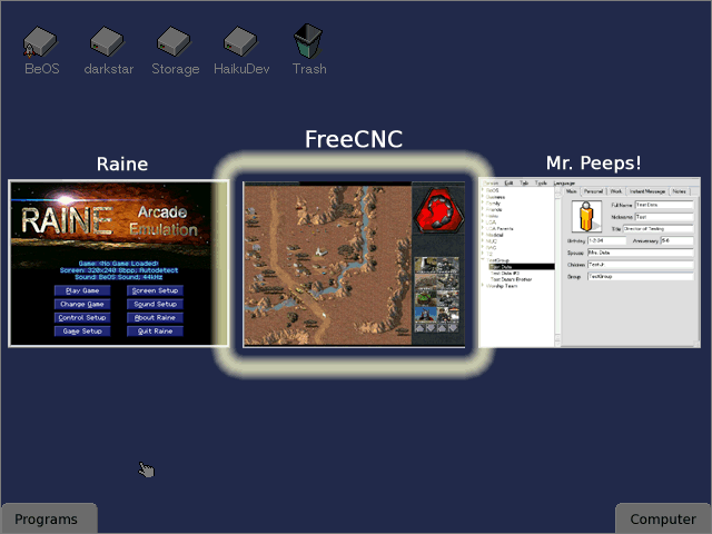
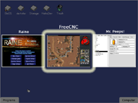
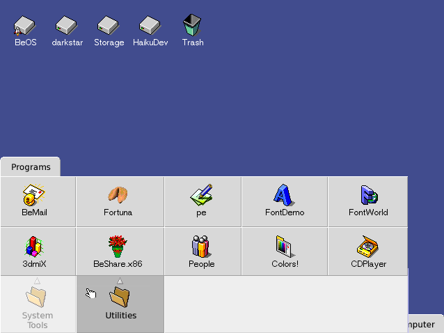
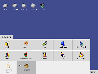
Launcher Replacement: Tab-Based Task Organization
Instead of a single point of access to collect everything together (the
Be menu), there will be a small group of tabs to provide better
organization similar to the OS X product DragThing (screenshot below)
and OS 9's Tab Menus. The user clicks on a tab and it expands to
display a grid menu which contains the name and icon for each
folder/symlink. Subfolders spawn a submenu in the direction moving away
from the screen border where the tab originated, i.e. upward when at
the bottom, downward when at the top, etc., and the parent menu places
a light-colored overlay over all items except for the selected item to
make the submenu stand out while still allowing the user to easily see
other items in the parent menu. The images below (click for a larger
version) show the steps.
This method will provide more width-depth balance -- the current
organizational structure is shallow and wide: the top menu has 10
items; the Applications and Preferences submenus -- which are at only
the second level of nesting -- have many more choices. Two clicks and
significant mouse navigation are required. This method takes advantage
of Fitts' Law in at least one direction. The large menu items also
increase speed and have a bevelled edge to convey the large size of
each item.
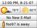
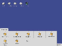
System Information: Enhanced System Tray
It seems like the current trend in user interfaces (OS X's Dashboard,
Vista's Sidebar, and Google's Gadgets) is to provide some method for
the user to download add-ons which look really cool and provide more
than what is provided in the system tray. This is because the system
tray's small size limits the amount of information that can be
provided. The Sidebar's Widgets and Google's Gadgets simply add a
window which consumes more desktop space. Worse yet, the add-ons
themselves tend to be not fit with the rest of the UI's look and are
larger than necessary, wasting the precious space taken up by the new
window and adding insult to injury.
The new system tray is similar to the Sidebar in Windows Vista, but is
less intrusive. As an option, it can always remain on top, but by
default it can be covered up by other windows. Add-ons are required to
be simple and uncluttered -- a few words and perhaps a picture. Instead
of using miniature controls, each entry is clickable. The default
action (such as starting the mail program for the e-mail add-on) is
invoked on left click and configuration is done by way of a pop-up menu
on right-click.
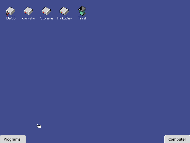
System-Level Settings and Functions: the Computer Tab
In a way quite similar to the Programs tab, the Computer tab houses
access to global functions and settings. The Preferences apps find
themselves placed here in submenu. The Find, About Haiku, Restart, and
Shutdown items are also placed here.
Window Management ImprovementsMinimize in Place
Minimizing a window can actually be a source of confusion for some
users. Merely by double-clicking on a window tab, the window disappears
and there is no apparent reason why or where it has disappeared to. In
fact, unless the user specifically looks at the Deskbar's running
program list or there are multiple windows open, the program appears to
have closed. In latter case, the document seems to have been closed.
The solution is to minimize the window to a miniature version of
itself, add the program's icon to its corner to further aid in
identification, and place it on the desktop. When a window is minimized
this way, the scaling-down process is animated to show its placement on
the desktop.
Right-click Desktop Menu (Window management functions)
Window management functions until now have been largely ignored and
have been limited to Hiding or Showing one or more windows in a
program. While these functions can still be used in the Running
Programs addon for the system tray, these functions will also be placed
in a submenu of the Desktop, so the user can right-click on the Desktop
and choose an item like "Hide Program Foo."
Show Desktop
Minimize in Place increases the need for being able to see the Desktop
because suddenly it is no longer just a kind of computer junk drawer.
Because of this new need, it is more important than before to be able
to quickly see it. Invoking this function from the Desktop context menu
(see above) or by hitting F11, all windows slide almost completely
off-screen. Hitting F11 again returns all windows to their original
positions.
Minimize All
Does a Minimize in Place for all open windows in the current workspace.
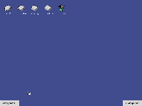
Workspaces View
Workspaces are feature of BeOS which set it apart from other OSes
(except the *NIXes) back in the day. Mainstream OSes today still don't
do justice to utilizing them because for them, workspaces are just a
bolted-on feature not originally intended in the design of the
interface. More so than before, workspaces will be a major part of the
user experience -- they allow the user to do much more at once and
still remain organized. The workspaces control will be similar to a
Replicant, but will be an integrated part of the Desktop, defaulting to
the center of the bottom edge of the screen. By having a 3D-accelerated
desktop, it will be possible to see live updates of all programs.

The control up close |  The control in context of the screen |
While all of this may be nothing particularly special so far --
integration and visual enhancement of a current feature -- there is one
more tool in the window management toolbox: a zoomed workspace view. By
hitting F12 or choosing the appropriate option from the Desktop window
management menu, the Workspaces control expands to full-screen size
(with a corresponding zoom animation). At this point, the user can
double-click on a particular workspace to switch to it, move windows
around, or just watch multiple apps working at once. Switching from
this full-screen view to a workspace results in yet another appropriate
zooming animation into the requested workspace to give context to the
user.
Enhanced Twitcher
Some users will not necessarily want to work with multiple workspaces
and prefer to keep everything in the same workspace, piled on top of
each other. For these users, there will be some small enhancements to
the current Twitcher. It will show a live preview of the window along
with the program name and the title of the window switched to when
released. A semi-transparent black overlay is placed in between the
screen and the Twitcher previews (in the Z order) In order to increase
the visual contrast from the actual desktop. The selected app's preview
has a "glow" selection rectangle placed around it and the
title header is shown in a slightly larger font size. The previews
themselves are as large as possible -- up to the full size of the
window -- and are scaled down only enough to fit all windows within the
width of the window. They are also placed close enough together that
the selection indicator slightly overlaps the others to visually "push"
the selected preview in front of the others.

Window Movement Constraints
Sometimes the user gets himself into a bit of a mess when a window is
somehow off the screen and he can't get it back on the screen. Small
changes in window dragging will help prevent these situations.
- Top / Bottom Tab Constraints - window tabs cannot be dragged below the bottom edge or above the top edge of the screen.
- Left / Right Screen Alignment - Using the Snap-and-Go techniques pioneered by Patrick Baudisch, allow the user to easily align a window to the side of the screen without preventing him from moving it further.
Hardware ConsiderationsOne
problem with depending on a 3D graphics card to do certain tasks in the
main part of the interface is figuring out what to do when there
*isn't* a 3D card or how to handle the differences in the capabilities
of each card. The solution is three-fold: implement certain functions
in software, turn certain enhancements off, and provide lower-overhead
alternatives to enhancements.
An example of using these methods to provide a good user
experience with less-capable hardware can be found in the new Twitcher.
Live previews would be processor-intensive, so instead of providing
live ones, the user is given a snapshot of each app's state when the
Twitcher was invoked -- a non-live preview. The soft-glow of the
selection could be replaced simply with one generated with a simple
solid-color rounded rectangle. Live updates to the goings-on under the
overlay would be handled in the same way as the live previews - take a
snapshot of the desktop, apply the overlay, and show the Twitcher.
While the enhancements will not run nearly as fast as the
hardware-accelerated versions, they should still be quite usable and
responsive.
Another low-power handling example can be found in the new
Workspaces control. Visually speaking, the control would look like the
current version -- small representations of the windows with text
labels. The zooming effect when switching between to full-screen
mode and a workspace could be eliminated or an outline rectangle could
be used.
Final ThoughtsThese changes are by no means small, but they have the potential to
make Haiku an operating system that makes the user's experience much
more enjoyable and productive for users of all levels of experience.


