


For the purposes of the novice user, Tracker is Haiku. Many people don't even know -- or care -- what an operating system is. As I have said many times before, the average person just wants to get his work done. This makes Tracker's interface crucial to user productivity because it is the main way for someone to use the computer. Many different kinds of people use Tracker. Some want to choose where each file goes. Many more don't care. Some (like me) fit into either category, depending on the moment. Everyone wants fast access to the programs he uses most. Tracker needs to have the ability to automate as much file management work as possible and still make it just as easy for the user to do things manually when he wishes.
The main file management tasks that are performed with Tracker (or components of Tracker) can be categorized under one of two headings: access and organization. The following improvements to Tracker can automate significant parts of both kinds of work without requiring the user to use them.
Improving File Access
File access governs more than just opening a Word document on a floppy disk. It also encompasses starting applications and copying/moving files. There are several ways to keep file access effort to a minimum. The first would be to provide easy access to frequently-used files, primarily certain applications and some of the user's documents. The Start Menu concept pioneered by Micro$oft was a step in the right direction, but a tab-based organization method for documents and applications, as proposed in the 3D Desktop RFC, will help even more. The second way would be to improve the file browser. The third way would be to give the user appropriate and useful search tools.
The current means of browsing the filesystem is based on the spatial concepts initially developed in the Finder for Mac OS, but this needs to change. Desktop computing has outgrown these concepts -- spatial methods are appropriate for small numbers of files, but they are less and less efficient as the number of the user's files increases. Today's desktop user has many files, from word processing documents and spreadsheets to digital photos and music. The Single Window Browse mode needs to be changed because it doesn't provide give enough feedback on where the user is in the filesystem. Merely having the name of the current folder is not enough. Instead, Tracker will use a default format quite similar to OS X and NeXTStep where navigation is done in a series of columns.
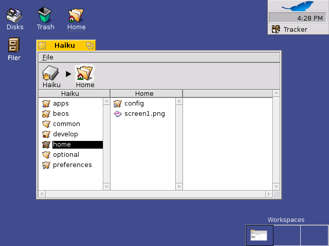
Column-based navigation is already present in BeOS, but its use needs to be expanded. A user can navigate the filesystem this way simply by right-clicking on a folder. It is both very fast and simple, but because the columns are displayed in a series of menus and submenus, navigation is not as easy as it needs to be. Menus are not well-suited to this task because of the fine motor control needed to move between folders -- the user must carefully navigate the cursor with precision usually reserved for gaming, particularly at high screen resolutions. Using a regular window for column navigation eliminates this -- clicking on a folder creates a new column to the right of the old one and displays folder contents or file information. At the top of the window will also be a breadcrumb bar which will allow for faster jumps up the folder hierarchy and to make the current filesystem location very clear to the user. Getting "lost" or forgetting ones current location is not normally a problem for advanced users, but it happens frequently for average users. An rough example of the layout for these changes can be seen below.
![]()
Note that while the main way for the user for browsing the filesystem will be using the column method, the single window browsing mode will not disappear entirely. It will simply not be the default. There are times where the user needs to be able to see details about entries in a particular folder, and an alternative for the user will be to use the existing List mode to navigate. The breadcrumb bar will still be available to the user for fast navigation and for additional context information. For those with limited screen space, the breadcrumb bar can be configured to use large icons with text labels, small icons with labels, or just the text labels themselves.
Integrated Search Technology
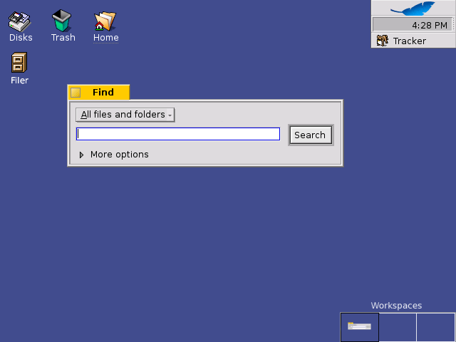
The Big Three operating systems (Window$, MacOS, and Linux) all have "search engine" technology available which enables the user with tools to search his files just like he would search the World Wide Web, but with better results and more options. In its day, one way that BeOS was ahead of other operating systems was its filesystem queries. Queries are powerful, but they have major limitations: they are limited to only BFS disks and they do not search within a file's contents. Full indexing of a computer's documents is needed to let the user search filesystems which do not support queries and also to search within documents. The current thought in many IT companies is that search technology is a "magic bullet" which will solve all of everyone's problems. It isn't, but it is a major part of the solution. Search can provide much of the automation needed to get existing files without having to do the file retrieval manually.
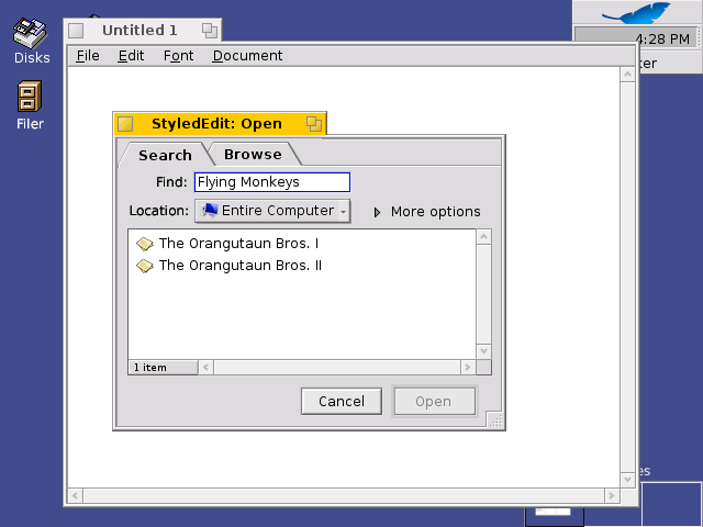
Proper integration is needed to maximize the usefulness of document search. This will be accomplished by changes to the Open and Find windows. The new Open window will contain two tabs: Search and Browse. The Search tab will provide a simple interface for the user to type in terms to find a particular document. It will default to documents of the filetype used by the program, sorted by order of most recent access. An expander will hide or show extended options. The Browse tab will provide the same familiar interface as current Tracker open panels, but with a breadcrumb bar replacing the popup folder menu.

The Find window will be both simplified and made more powerful. The current interface makes complicated searches relatively simple, but simple searches require much more effort than they should, including multiple switches between the keyboard and the mouse. The new Find window has fewer controls and operates more like a search engine -- the user can limit searches to a certain kind of file and enter in terms to be searched in the document's name and/or contents. An expander is available to reveal the extra controls needed to create complicated searches in the same way that it currently does for Search By Attribute. Advanced users will also find the new interface does not sacrifice power: regular expressions can be specified in the name by preceding a term with REGEX: just like it can be done currently with settings for mail filter preferences.

Improving Organization
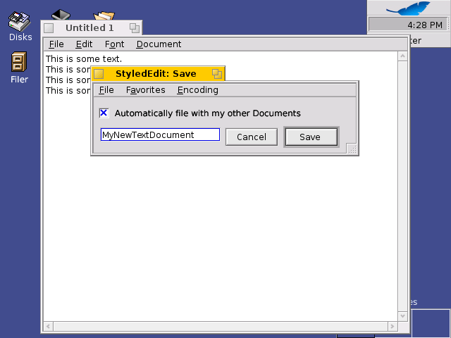
Manual file organization is a burden that is responsible for countless instances of users having lost documents on their hard drives. Basic forgetfulness and sometimes a lack of a sufficiently obvious indicator for filesystem location -- the user *thinks* he is saving his file in one location when, in fact, he is somewhere else. How often does the location of a file really matter in the first place? Frequently or rarely, depending on what's being done and who's doing it. Office workers often don't care where documents are kept so long as they are easy to find. Many developers like to keep all files for a project in the same folder or in a hierarchy under a folder dedicated to a project. System administrators don't normally worry about where a user keeps his documents as long as it's in his home folder because it makes backups simple. Automation can be very helpful in filing, but it must be possible to control how much automation there is or how often it is used. Some slight modifications to the Desktop and a new Save window can provide some helpful automatic filing without taking control away from the user.
All filing-related changes center around the Filer. The Filer is the proper name for the Sorting Chute concept originally conceived of on the Glass Elevator list. It automatically organizes files for a user according to a set of rules that can be customized. The RFC itself proposes a replicant for placing an icon on the desktop, but because the Filer is an integral part of the Save window, the icon for the Filer should actually be a part of Tracker like the Trash or the Disks icon. However, this icon could be hidden for those users not wanting one more icon adding clutter to their desktop. By adding the Filer to an easily accessed place on the desktop, the user can easily drag and drop a file to it and move on to other tasks, having moved it to a safe, organized, logical location without any of the work involved.
Along with an icon on the Desktop for the Filer, a new Save panel will also be needed. It will utilize the Filer's sorting rules to automatically save documents to an appropriate place or allow the user to manually choose a location for the file. A checkbox, when unchecked, expands the save panel to reveal a file browser window very much like the Browse tab for the Open panel. Normally, all the user has to do is give the document a name and hit Enter or click Save and the rest is done automatically.
The Desktop
Along with the use of the Filer, there is one other small change which will also help the user: a change in the default setting for displaying disk icons on the desktop. The desktop -- as in the part of the screen which is a placeholder for replicants and displays volume icons and the Trash -- does not need many changes. The Disks icon should be displayed on the desktop by default to reduce confusion. A common mistake for novice users is to click on a volume marked BeOS when asked to go click on "the BeOS menu" (as in the Deskbar). The concepts of volumes and mounting, while relatively simple, are foreign concepts to non-technical users, particularly those with only a Windows background. There are other changes which are not technically part of Tracker, such as the Workspaces control, launcher tabs, and an improved system tray, but these are discussed in the 3D Desktop proposal.